Sunday, 9 May 2010

Evaluation qustion seven

Looking back at your preliminary task,what do you feel you have learnt in the progressions form it to the full product?


Looking back on my preliminary tasks i feel i have learned a great deal about,taking photos,using photoshop itself,and how to overall to make a magazine look proffesionalWith my first task i used the most basic of layouts,colours,and images but i now know the value og having a good layout on the page,good colours,and most importantly good images.The images i used in my final task i feel are huge deal better than the ones on this task as i took into consideration things such as poses,backgrounds,and the actual models that were in the picture so to make sure they were appropriate for the scene i was trying to create for my magazine.Photoshop has been a big learning curb for me on this task as i have learnt an awful learnt on how it works and how to use it properly to get the desired affect on your product which i wasnt able to do previously with my preliminary so i used the most basic of methods to get the result i neededw hich in my opinion didnt look very good.In making this magazine i feel i have learnt and put into good practice how to make a magazine look proffesional using all of the conventions you see in everyday magazines,things such as images,layouts,and colours.

Friday, 7 May 2010

Evalation qustion six

What have you learnt about technologies from the process if constructing this product?


In the process of constructing this product i have learnt how to use a camera a mac computer,and the software photo shop.To begin with i used as 8.0 mega pixel camera to take my photographs which allowed me to get good quality images which were needed in my magazine to make sure the images looked professional.I hadn't had much experience with using a camera properly in the past so learning to take pictures professionally was a real challenge as i had to take into consideration light,poses,and positioning which take a lot of Patience when working with models.Some of the pictures i took i am very proud of and think i did very well with considering the knowledge i had of what makes a photo look proffesional these are just some of the pictures i took.

I learnt how to use photoshop,although i had had experience in the past using it i did still find it a little difficult to get used to in the terms of using all the different tools for the right job which can be hard sometimes in understandin which tool does what.In using photoshop i did come across a few problems when workingon it such as things as the program itself sudenyl closing down and causing to lose unsaved work which can be a real pain when you get a lot done and its then lost and you have redo it all to the best of your abiliy trying to remeber how you did it before can be really diffcult.

Thursday, 6 May 2010

Evaluation qustion five

How did you attract/address your audience?

I attracted my audience by using all of the things that would be found in a magazine but changed them all to the specific style i was going for by using images,customized text,and personlised layouts.The images i used were of models which personally themselves had the same style that i was doing my magazine in which was the metal/rock scene so their overall image to begin with was extremly helpful in clearly portraying the style and feel of my magazine.Adding customised text around these images then helped along with the (metal feel of the magazine as i used a metal style text alongside the images to compliment it wich together i think work very well.The layouts and colours i used were unusual for a mainstream magazine but were normal for a metal magazine so using the colors red, white and black and making shapes to go behind text to make them stand out more will work really well in setting them apart from the other magazines and making them very eye catcthing for the audience i am aiming for.The images throughout the magazine were a constant house style of the same type of clothing hairstyles,looks all together but the layouts throughout were changed which didn't matter because the similar styles of the images still established the fact tat it was a metal magazine so a constant barrage of colours and customized text wasn't needed all of the time and where it wasent necessary.My main focus to establish the fact that that this is a metal magazine was on the front page as it is the first thing that a person will see so making sure they know what genre of music is in the magazine is very important,making it look interesting also is very important ans know body will buy it if looks boring and dill so making a good impression with the front cover to the target audience with relatable styles,and images was one of my prime concerns.

Evaluation qustion four


Who would be the audience for your media product?

The audience i have aimed for are people that are interested in metal/rock music which would be bands such as,Bullet For My Valentine,Slipknot,Linkin Park,Machine Head.The target audience would be between the ages of 20 to 30 and would be either male or female as i feel aiming for a unisex audience would be very beneficial to the overall success of the magazine in hopefully attracting a bigger audience.Aiming for that age group meant that i had to be very careful in choosing the colours,images etc as i would have to make the right choice in these factors other wise it would have not interested this audience as it may have been too boring or too over the top.For example the younger people will like good pictures of the bands and will want an array of color on the magazine,where as the older generation will want less colour and not as good quality images in the magazine as they would probably be more interested in the story that goes alongside them.

Evalution qustion three

What kind of media institution might distribute your media product and why?

a company called Bauer Media who publish magazines such as Kerrang and NME would publish my magazine as mine is very similar to the magazines they already publish and would pose no problem in being able to fit in the sector of music magazines.

www.bauermedia.co.uk/


Another company that might publish my magazine is Future Publishing as they publish metal hammer which is the same style magazine as mine so i think my magazine would would interest the publishers as knowing how successful metal hammer is I'm sure they could do the same with mine.

http://www.futureplc.com/


Evaluation qustion two

How does your media product represent particular social groups?


The syle of my magazine and the group of people it is aimed is very clear from the start by especially on the front cover which is the most important part of the magazine as that is the initial part of it that draws in the potential customer and catches their eye.The first and the most important of these factors is the look of my magazine which includes the look and style of the models and colours and layouts used in the magazine all together.The look of my magazine is aimed at people who are interested in metal music also known as,grungers,metal heads,goths,emos.So i have represened that kind of style in my magazine with the models ive used who are metal heads themselves who have long hair,piercings,and wear clothes which consist of dark colours, t shirts with band logos,and they wear skinny jeans.


putting a image with models that look like this on the front cover immediatly draws peoples attention to the magazine who are intrested in metal music or a metalhead etc themselves.The poses that the models are in also helps to represent the social group of they are following as only somebody that listens to rock/metal music will be making a devil horns jesture with their hands.The dark colours used in my magazine which consist of the reds and the blacks are directly associated with metal so they are very relevant in my magazine and the people that are part of the metal music social group know this so immediatly recognise these colours and this is what makes the front cover eye catching and relevant to them as it is a clear representation of their style of music.


The majority of people that would be reading a metal/rock music magazine will be young people so i have used young models in my magazine to represent the age factor in music to show that young peoople can be famous so that readers can relate to the people featured in the magazine if they maybe want to become a musician themselve or are just interested to know that not everyone has to be old to be able to make a band and become succesful..If i had used a older model on the page people would not be as interestd as much as the person is not the same age as them so they cant really relate to the person featured which is what intrests some people when reading a artcile about a musician.

Evaluation qustion one

In what ways does your media product use, develop or challenge forms and conventions of real media products?

My product uses the majority of the conventions found in any other magazine which include the placement of headings,images, and organisation of things like the way the pages are organised on the contents page.I have developed my own style on the front cover of my magazine but at the same time challenged it because i felt it necessary for the style of magazine i was producing.On my front cover i have everything is leaning to the left which would not normally be the case on any other magazine,normally everything would be straight and placed perfectly to make it easy to read and understand.I decided to do this on the front of my magazine because it represents the rock n'roll style i am aiming for where everything is not straight and perfect,but untidy and unusual because the style of the magazine is not aimed at the normal/mainstream audience.


For my contents page i chose to to steer away from the usual conventions of a normal contents page and change it so it would be appropriate for my style of magazine in terms of colours,placement and kind of language used. i chose to you use plain colours of white and black for backgrounds and borders as it was plain and basic but still kept to a reasonable style i was sticking to of metal and rock which these colours can be associated with.With the placement of pictures i didn't put pictures all over the pace to make it look crazy i organised them in a simple way so that they can be seen clearly and in some detail and would look more like a conventional mainstream music double page spread as i didn't want to risk doing things like adding bright colours and unnecessary images which would ultimately make it look a complete mess of just text and images.The type of language i was using was completly unconvenional to normal mainstream music magazines as i did put a lot of swear words in my magazine,i did do this for a good reason though.The genre of music that my magazine is based on metal,swearing is very acceptable and normal to the audience,when they buy a metal magazine they expect their to be swearing somwhere in it as metal/rock music is associated with a lot of older men/slash women that will swear as it is linked to their overall hardcore image and stature in the music that they play.For example if a metal musician is in a interview with a reporter they will not hesitate to swear in front of them as they know it will get printed in the magazine and the reporter does expect this when interviewing them as it is linked to the social group they are involved in.


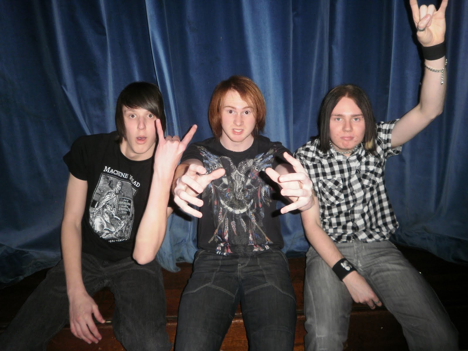
i have designed my double page spread in a way so that it follows the conventions of a normal double page spread,in the terms of it splitting over two pages,not having text crossing over the middle,and having at least one image crossing over from one side to the other.I didnt choose to challenge the normal conventions on my double page spread as i thought it would look too messy and just not suitableat all if i tried to make it look like the style of my my front page.

Wednesday, 5 May 2010

Construction of the Front page


step 1)This is the photo i chose to use on my front page which i cropped firstly to make the picture a bit bigger in the terms of making the models take up more space on the page and cutting out the background on the side of the page completely to give the focus of the image on the models.

I then used the magnetic Laos tool


which allowed me to go around the models and separate them from the background doing this could then let me to change the colour of the background to black without affecting the models.


Step2)step 2 was adding all of the text to the front page which included the master heading and the main story,to do this i used the text placement
tool.


I then moved all of the text around the page to the relevant places and then chose the style of text for each piece of writing.For the piece of writing related to the main story located on the right side of the page i aligned each line of words so each line didn't look out of place or uneven.I did make the bottom line of writing slightly longer than the top to give a slight contrast to the sentence and make it look more to the style of the magazine of untidiness and rock'n roll with not everything being straight and in place where it would normally be in a normal mainstream music magazine


Step3) involved adding the pug to my front page which was done in three stages the first stage
was drawing out a red circle.


the second was putting a smaller black circle over the top of the red circle


i then used the dissolve option on the brush tool.


to dissolve the the red circle into the background to give the affect of the circle disintegrating.


Step4)Step 4 was themaking if the shapes to put behind the pieces of text on the page,to do this i used the shape selection tool.


I then drew out rectangles and other shapes and moved to the right places on the page,i also tilted all of them slightly so they were all on a slight slant to the left the same as the text.


Step5)Step 5 was the final step in constructing my front page which was putting the images on.I did this by dragging them into photo shop and them cropping them to a approrpaite size which then allowed me to place them on my front page without the problem of over sizing.


i did this by going to the top of the page clicking on image and then crop.


i then dragged the image onto the front page page and place it
where i wanted it.


Tuesday, 4 May 2010

results from Poll

Magazine name:Who Wants Some

price for a free gift if i choose to include one:30p

Price for the magazine:£2.00

magazine that people buy the most is:Metal Hammer

Colour Scheme i will be using:red,white,black

People listen to music:everyday

the genre of music that most people listen to is:metal

The majority of people who took my poll are between the ages of:17-22

The majority of people who took my poll are :male

Monday, 3 May 2010

Photograph Analysis


Front Page

1)This picture will be ideal for my front cover as their are the 3 members of the band that will be featuring in the story in my double page spread,they are all stood in a good position which very good and unique poses which are relevant to the style of the magazine.The space around all of the 3 models is very good as i can add text and pictures with out any problems of covering up the models faces,The contrast in colours is also good as their is not just one shade of colour their is a mixture of them which will work in the favour of the background i will be using and will make the models stand out more which is needed on a front cover.


Contents Page


2)I think this picture will work very well on my contents page as a heading to as it is a very clear big picture of the models and will sit well at the top of the page with text underneath it and maybe some around the edges.I think it also works well in conjunction with the (metal) style of my magazine with the colours involved,the props and the setting behind of a stage like scene.


Double Page

3)I think this is a perfect picture for my long shot images of the individual models as it shows the model clearly against a good background and leaves plenty of space in the corners of the pictures for me to add text.I have chosen this specific pose for the model because i think it is very unique and gives the impression he is very relaxed.I will be using this particular photo at a bigger size on the page than the others as in all music magazines the front man to any band is the main focus and has the biggest photo on the page when shot individually.


4)I have chosen these two pictures to use as group photos on the double page spread as i think they are very striking in terms of the poses and relevant backgrounds,which entail a stage scene which is the style throughout all of my images.I have made sure to get a good picture of the whole of the bodys of the group so that all of them are seen properly and not just the top half of them which i think is important in a group photo where a story is connected as it allows you to see properly who you are reading about and helps you understand the people a bit better by seeing the way they dress and look.


5)I will be using these two pictures on the double page spread for the individual pictures of each band member,Both of these two images have the same background as it is the same house style throughout all of the images.In lukes picture i felt using a amp as a prop for him to put his foot on would give more of a (metal) feel to his picture as he is the guitarist in the band the amp also fits his profile so i thought it would go very well in the picture.In joes picture i felt doing the pose of crossing his arms would be a good idea,as he is the drummer in the band sterotypicaly drummers in bands are not as involved as the others and are generally not seen or heard of as much as the others so i deemed it right to choose this pose to give the impression he dosent care and is slightly angry.


Sunday, 2 May 2010

Double Page Spread


My finished double page spread

Contents Page


My finished contents page

Front Page


My finished Front cover


Target Audience


This is a example of my target audience This is Andrew he is a metal head from london he is 26 and lives in a flat with his two roomates craig and paul.he dresses in a very noticable manner which is that of a typical metal head style of long hair,a leather jacket and a beard.Andrew loves to go to gigs,the pub,and partys with his friends on a regular basis,his motto for life is "live it to the full or you will not have lived at all"which is refelcted in his crazy and daring personality of being the one that will doing anything if asked regardless of the consequneces.Andrew has been playing the drums for the past 5 years and has become exceddingly good at it and is looking to join a band while continuing his daytime job as a cashier in HMV.Andrew enjoys reading,Kerrang and Metal Hammer magazine and his favourite bands are,Slipknot,Ill Nino,Trivum and Machine Head.

Thursday, 11 March 2010

XBOX 360 MAGAZINE TWO PAGE SPREAD


Colour:The colours used are very dark and dingy greens and blacks to give the impression of a old and evil forest which isn't exactly natural.The colour blue is used in the two images once for the colour of a alien type plant which has a kind of ambient glow indicating its not natural or of this planet which establishes the fact that this game is set on another planet.The second time it is used is for the electricity coming out of the characters hands it is also outlined by the colour white which gives it the look of lighting which makes it look evil and explosive.The final colour that is used is the colour is is used for the text boxes on the right hand side of each page this particular colour is used because the colour red in the star wars universe represents the dark side which is the focus of the game so it has a real significance on the page.

Design:The design style for these two pages is done in such a way that the text is completely separate to the images so that the text can be easily read and doesn't effect the image in anyway.Pictures of characters are on put on the right hand side of the two pages set in a descending style with a relevant short paragraph of text accompanying them on the left of each image.The style of the two pages is done in artwork style as the two images are placed onto a plain black background to simulate two artwork drawings placed on a black canvas.
Images:The image on the first page of the double page spread is showing an alien like forest which tells us that what they are showing us isnt natural and is purely fictional.The colours usd in the images are very dingy colours such as grays and dark greens but their is then a blue ambient glowing plant which yet again says to the reader it isnt natural.The image on the second page is of a man shooting lightning out into a forest wtih people flying thtough the air which shows he is extremly powerful and capable of things that people would not normally be able to do.The image of him doing these leaves the reader to decide who he is,what he is and why he is killing the people.
Pose,style,hair,make-up:The character on the left side of the page seems to be standing in just a standing pose of standing straight upwards with his arms pointed out towards the forestshootinf lightning ,The style type of the character i would say is kind of evil type as he is not wearing any nice clothes and the clothes he is wearing seems to be like combat type clothes as their is a lot of ragged and torn bits of cloth hanging off of it so this gives the idea that he is maybe a evil person that does a lot of fighting and killing.
How are the words used:The words used in in the double page seem to be very big impact words such as Make That Game! which shows that their is some very big hype about this game and people are the developers are very excited about it.
Language:The language used is aimed at the people who know about games as only they would understand some of the words used such as,NPCs and three ky collaborations.If somebody else read this page they wouldnt understand what the writer was talking about at all so it wouldnt interest them,language like this interests the audience of video game players as it makes them feel individual as they are the only people that can understand this type of language.
Overall Impression:I think the way the two page spread portrays the sinsiterness of iteself towards the reader is very good as it dosent give too much away and leaves it open to thought so the reader has to work out for himself whats going on,if the character is eveil or not,where he is,who he is.The pages are very well aimed at the video game type reader due to all of the factors that are added in such as,lightning coming from the mans hand,a strange place,and somthing completly fictional that tis type of reader can relate to.

XBO 360 MAGAZINE CONTENTS PAGE


Colour:The colours used are mainly whites and greens as these are the representative colours of the xbox 360 concolse itself and having them in the xbox magazine makes the reader feel like it is all relevant to them.Screenshots of games are used in the article which all have their unique colours and designs,so the colours are not a constant style through the two pages as they differ from image to image.


Design:The overall design of both pages is very detailed as each subheading comes with some brief detail on the article itself with a page number next to it which makes it very clear what article is on what page.The big articles in the mgazine have a image to themselves and are accompanied by a page number which clearly show you what page they are located on so people are drawn to what article intrests them.The overall text itself is quite small to allow a lot of things to fit on the page such as images and bigger subheadings which enables a lot of different things to be put on the page.The headings right at the top of the page saying the name of the magazine and on the next page saying the month and the contents page give the two pges a bit of contrast between each other and make each one look a bit more tidier rather than just having a white blank space their or more writing.


Images:The images used are of screenshots from games as they are the main things that readers want to see so the writers make a effort to put the best screenshots possible in the magazine relating ot that game.Smaller images are used on the page which just have a page number on the actual image which indicates to the reader this game is on this page without giving out to much detail.


Pose,style,hair,make-up:No pose,style,hair,or make up is used in any of these images as they are all screen shots from games and are just pictures of different things with no particular house style.


How are the words used on the cover:Words on the contents page are used in quite descriptive ways as their is mostly a description after a subheading of a game which will tell you what they will be talking about on that page.In the other magazines ive analysied their seems to be just one word describing whats on a page but inb this magazine their seems to be a more in depth description.


Language:On this page a lot of desriptive and eye catching words seem to be used such as (Exclusive) which makes the reader want to read on and find out why this word is used as it is a intresting word which entises readers to want to turn to that page.The language used is very directed at people who read the magazine regulary as the type of words used can only really be recognised and interpreted in the right way by people who are intrested ingames words such as marketplace content,Achievments,or sandbox.


Overall impression:I think the overall layout of the contents page is a bit bunched up which can make it hard to read but the layout of the images relating to text is done quite well and the size of the text is just right as it is not too hard too read but not too big at the same time. .

Tuesday, 9 March 2010

XBOX 360 MAGAZINE FRONT PAGE SPREAD

Colour:The majority of the image is done in black and their is a white tint used to show the reflection of light on Darth Vader's mask.Silver is used for little screws on Darth Vader's masks which gives the image little finish and makes it a bit more interesting.

Design:The design for this page is simple yet affective,The image itself is placed directly in the middle of the page to give a sense of authority and power as normally images are placed to one side or the person is in a certain position,this image is just right in the middle lokking directly outwards at the reader.The word star wars is placed in front of darth vader so we know exactly what this magazines main focus is even if a person reading wasent familiar with the character.The title of the magazine is placed directly at the top of the magazine with no specific positioning or placement and it is then accompanied by smaller text around it.


Images:The main image used is of darth vaders head looking outwards towards the reader this is used because the image relates to the main article in the magazine and i will grab readers attention that are intrested in star wars. A white light is placed behing the character himself so that it reflects off of his helmet and gives the impression if heim being god like and very powerful.The image of the xbox 360 logo is used in the top left hand corner to establish the fact that it is a xbox 360 magazine and it will also catch peoples eyes from afar and they will immediatly recognise it as being a xbox magazine.


pose,style,hair,make-up:No make up or hair styles are used as the person presented on the front of the magazine is in a suit so none of these things are needed.The pose in the image is very unclear as the face is hidden with a breathing mask and no facial expressions can be seen,but looking closley at the bottom of the page you can see that the characters arms are crossed showing a state of power and.


How are the words used on the cover:The words youlle be gripped are used under the image of darth vader to indicate they relate to him and would only really be relevant to people who know of the the star wars saga and the relevance that word has in relation to him.At the bottom of the page the names of games are listed to show the reader the games that will either be reviewed or talked about within the magazine which is a simple yet effecxtive technique to save space on the page.


Language:The language used is very short and simple as the writers of the magazine seem to aim for a very short information basis where they just write one word on the cover and know that the reader will be instantly intrested due to the nature of the magazine and the readers that are intrested in it.


Overall impression:I think the image on the front of the cover is done extremly well as it delivers a striking image that readers will be instantly drawn too as well as it being recognisable to fans of star wars.The text on the page could have had a bit more detail to it maybe saying in brief what was contained inside on one of the other articles of intrest within the magazine.


Tuesday, 2 March 2010

METAL HAMMER TWO PAGE SPREAD


Colour:very bright and industrial colours are used in the image such as blacks, ambient blues,and bright whites the reason for this is is that it is a city style Tokyo setting so bright and ambient colours are needed.The majority of the colour on the page is a dark black background which then has colour built around it such as,red for blood splatter,white for the building lights and blue for the night sky

Design:the design of the page is set out in such a way so that the writing doesn't interfere with the picture behind it,it is up in front of the black vest of the person featured which acts as a perfect canvas to put white writing on,doing this allows text to be put on the image without it taking up any more space on the page but ye still remain clear.On the second page little words seem to be scattered around the page in relation to the picture so they don't take up too much space but still make an impact for example the name of the band is put in the top left hand corner of the page.

Images:The image shown is of the lead singer of the band holding a sword against a city background,the city is Tokyo as it is a Japanese style album so it all ties in with the overall image of the album.Having a image like this helps to promote the album as he is in a Japanese city with a Japanese sword which establishes the fact More and more that the focus of their music is a kind of Japanese style.

Pose,style,hair,make-up:The style of hair on the front man is a yet again Japanese style as his hair is tied up and put into a samurai style bun but it still has a sense of metal style to it as he still has long black hair.Tattoos are on the front man which establishes the fact that it is a metal magazine and that he is from a metal band,the tattoos themselves have a kind of Japanese style to them which again establishes the Japanese feel to the article.The front man also has tunnels in his ears which are now a common piercing within the metal music scene so this again establishes the metal style within the magazine,the pose he is standing in with the sword also reflects the metal image of power and control but still carries on the Japanese feel of the article because of the sword itself and the way his standing.

How are the words used on the cover:The word at the top of the page shogun is the past present and future is used to reflect yet again the Japanese style of the magazine as Japanese samurai related things are very old but it gives the impression that the new album has sort of brought it back to life.

Language:the language used is very descriptive words that describe the bands success and achievement in just one word to capture the desired audience and keep them reading.The title "return of the warlord" refers to the bands returning success but while doing this is still relates to the Japanese style of things.
Overall impression:I think the image of the singer and the background is done very well as they both contrast each other and give a very good feel of a Japanese city backdrop as well being accompanied by a samurai sword and Japanese style hair by the singer.I think the way the text is set out against the singers black vest is very well done as it acts as a natural canvas fro the writing and doesn't take up any more space on the page than is necessary.

Monday, 1 March 2010

METAL HAMMER MAGAZINE CONTENTS PAGE


Colour:The colours used are mainly very bland colours such as blacks and whites,the colour red is occasionaly used in headings and bubbles of text to add a bit more diversity to the page.The colours used are for the specific reasons of creating misery and darkness as it is a metal music magazine, this is a typical style as the stereotypical coulor for metal orientated things is black which includes,clothes and hairstyles.


Designs:Subheadings are used on the left of the page to to outline the main feature in a certain article,the heading itself has a bold title with a strange type of old english font and the brief description is then put underneath.Bigger features in the magazine have a picture with a page number on them as these pictures are normally of people of importance or are easy to recognise a descriptioj is not needed as we already know who they are.


Images:The images used on this page are of the bands featured in the article such as the picture of matt heafy at the top with the sword that picture is their because they are a big part of the magazine so they have a big picture to represent them.All of the images on the page are of bands because if we see a picture of a band that we like it will encourage us to read on about them doing this is much more intresting that just putting a brief little description on the page about whatever band doing a certain thing,people dont really get intrested by it thats why the magazine put up an exciting image to intrest people to read on.


Pose,Style,Hair,Make-up:In the images put o the page the style in each picture is different but remains basically the same through each one with each person having long hair,piercing,tatoos, which establishes the fact this is a metal orientated music magazine.Putting these images in the magazine creates a sense of comfort for the readers as they see famous band with theses sort of things which makes them fee normal oif they have the same as these people are high up in the music indusrty regardless of what they look like which could inspire other people to do the same.


How are the words used on the cover:The words on the cover are used very simply their just simple basic title with little brief descriptions underneath with the occasional picure accompanied by a page number indicating their importance.Identifying whats on each page is easy by reading the short description for some of the pages but finding out whats on the pages which just have a picture and a page number is much harder,the magazine ghas done this because they see this article as a significant part of the magazine and what you to read on and find out about it.


Language:The language used is very slang like as it just takes them a couple of words to describe whats going on such as the trivium heading which says "panic attacks engagments,accusations that they lost their metal....hammer gets to the bottom of what inspired their new album shogun which is samurais basically".This type of language wouldnt be understood in any other magazine as it is the type of language that is in a metal style magazine.


Overall impressions:i think the overall style of this contents page is done just right due to the slang type language and eye cacthing images its just right for the type audience that they are trying to attract.The style that the page is done in is done in a good typical metal style of just straight to the point with images with just a page number next to them,and also brief descriptions of each article with not too much giving away in what their saying which encourages people too read on.

Monday, 22 February 2010

METAL HAMMER MAGAZINE FRONT PAGE SPREAD


Colour:The colours consist of red black and a bage background with a black gradient around it.the gradient on the page gives it the affect of a old Japanese parchment type sue to the colours used and the style.The colour black is used in the middle of the page to give boldness to the image and draw people attention.

Design:The title of the magazine Metal Hammer is done in bold to establish the name of the magazine and draw people attention to it that know the magazine well.The title is placed against the white background to give it some contrast in showing the title of the magazine in relation to everything else.The title itself is done in a specific design of having the word HAMMER in the top middle of the page and the word metal in the letter H in smaller letters to give a unique style to the title and overall design of it which is recognisable by regular readers.

Images:A picture of the band Trivium is used which clearly shows it is a metal orientated magazine due to the tattoos,piercings and style of hair on the people in the picture.The sword that the lead singer of the band is holding suggests a image they are trying to create which in this case is a Japanese samurai style as it is what their albums reflected on.

Pose,style,hair,makeup: The band is in a pose which would suggest a sense of power as the singers holding Japanese sword and the rest of the band is behind him showing that they are with him.the style of the band is clearly metal because of the clothes the band is wearing and their overall appearance. The hairstyles of the band members is either long tied up in a pony tail or very short hair which are very common hairstyles n the world of metal.No makeup is visible on the faces of the band members but k assume basic concealer would be used on the band as they are in a photo shoot and would need to look their best.

How are the words used: The title of the magazine is placed at the top of the front page to grab the attention of any one looking in its direction and is put in bold so it makes a statement on the page. The names of the bands featured are at the top of the magazine also but in a smaller font so they can all fit in but at the same time are still big enough to grab our attention.

Language:The language used is very simple its just the title of the magazine Metal HAMMER and then the names if bands reviewed inside its very simple language and straight to the point.

Overall impression:I think the overall design of the front page is very good as it is simple yet detailed to the extent that it catches your eye when walking past,the colours and images involved all contrast each other in the right way to get the desired affect that they aimed for.

Tuesday, 16 February 2010

KERRANG MAGAZINE TWO PAGE SPREAD


Coulor:The colours used in this 2 page spread are very dark colours which give the impression of a dark heavy metal themed page which also relates to the image of the band.In the background their are holes punched into a black background which let through white light which breaks up the image and gives it more definition.

Design:The design of the picture is done in a way so that it carries over from one page to the other,The strapline of the picture "Angels and Demons" is placed in the middle of the page in front of the page giving contrast against the word to show that it is souly aimed at them.The strapline itself is put on two pages and split up on either page with one page saying angels and one page saying demons showing theirs a evil side and a good side to the band.The word angels is written in a kind of old style font what looks like its been written with a quill showing a relaxed take on things,and then the word demon is written in a solid bold form giving the impression this are bad and not how they should be.

Images:The image of the band is placed against a black background with light shining through which shows they have power,the holes in the background you could say resemble bullet holes which would give the reader the idea that they can withstand everything that is thrown at them.

Pose,Style,Hair,Make-up: the band is standing in a very dormant not caring manner showing they don't care which gives a distinct impression heavy metal orientated music.The bands overall image of tattoos,hairstyles,facial hair,and piercings is undoubtly the image of a metal inlfuenced band which is undeniable to the reader when they are looking at the picture.

language:the language used is simple but eye cacthing because of the words used such as reluctant which makes us want to know more and read on because words like that used in a review intrest us if their about famous people so it makes us want to read the article.

How Are The Word Used:The strapline suggest a evil and good side to the band because of the words angels and demons used.Using these words suggests that the band has maybe been though some rough times and good times and in the article about the band it will be explained.The on paragraph in the bottom right hand corner of the page grabs the interests of the reader.

Overall impression:I think the overall relation done between the picture and the words is really well done as they all blend together really well and nothing looks out of place.The colours are used very well as its a good consistent style throughout the image and the text and they all making them all contrast each other with lighter shades of the same colour and also darker shades.

Thursday, 4 February 2010

KERRANG MAGAZINE CONTENTS PAGE


Colours:the main colour in the contents page is white which shows up the black writing really well and makes the pictures stand out better than on a black background for example.Yellow is occasionaly used to make headings and borders which breaks up the picture and makes it a bit more colourful.

Design:small pictures are all over the page with the heading underneath them giving a brief entale into what the picture means and relates to.their is headings on the right of the page focusing on each section of the magazine and then grouping certain storys and reviews into that section.The font used is a very bold basic font which is easy to see but makes a statment none the less,the colour for the writing used s yellow which reflects the over al house style of the magazine.

Images:images of the band related to the story underneath are shown,they are generally just a image of the band themselves or the lead singer standing against a chosen background making gestures or facial expressions.The pictures of the band represents them as cool/famous which makes people want to read the article on them as most people want to know what goes on in famous peoples lifes.

pose,style,hair,make-up:The image of the bands is metal influenced due to men with long hair,people with lots of tattoos and piercings.the poses they are in as well such as corey tailor in the mask grasping towards the camera gives the impression of violence which is established by the scary mask he is wearing.

How are the words used:lots of headings are used to show you whats inside the magazine such as reviews and storys,they are then accompanied by smaller headings below them giving them a bit more detail of whats on that page.The contents of whats in the magazine can be easily identified looking at the contents age from a distance as the pictures are accompanied by big bold words which tell you briefly what on that page.

Language:the language used is very basic and straight to the point so the reader knows immediatly what the main focus of the article is.The use of this langauge grabs readers attention as it is their kind of language so it is quick and easy to recognise.

overall impression:I think the contents page shows very well whats inside the magazine by giving a mixture of pictures accompanied by text.It does a brilliant job of giving a representation of the famous people inside by giving them eye grabbing sub headings and cool photos.You can see from this page that the magazine is aimed souly at people who like metal music and it would not be read by people who like pop music for example. The readers inrest are represented very well by the photos that they love to see and the quick and easy language used in the magazine.

Thursday, 28 January 2010

KERRANG FRONT PAGE SPREAD


Colours:the majority of coulors are blacks and golds which is good for the writing to contrast against the black background which allows it to be easily read.The colours give a male impression of the magazine as it is dark colours and metal music influenced.

Design:Big explosive words that stand out,all the words are in capital letters to jump out to a persons eye when on the shelf.The words are printed over the image to give contrast and flow to the image itself.The title of the magazine is put behind the band to give the idea of a 3d image which makes it more realistic.

Images:the main image is a picture of band in silver ambient light looking like they have power,authority and stature.The image is aimed at fans of metal music as it is a metal music influenced image because of tatoos hair syles and piercingsa image such as this would easily draw in fans of this type of music.

pose,style,hair,make up:The band is in a standing position looking very expresionless towards the camera,their style of clothes also reflects their expresiions.The overall style of the band is clearly established as metal influenced due to the piercing and tatoos,also the kind of hairstyles and facial hairstyles backs up this meaning even more.

use of words on the cover:Title of magazine in their own style of font which shows they are a well know magazine brand,strapline of the name of the band showing you that they are the main focus in the magazine,doing this draws fans of the band to buy the magazine.Big font to show off whats inside at a distance catches the eye of passing people in a shop.

language:the language used seems to be very shot sentences with a big descrpitive word making the whole sentence make sense and relevant to what they are talking about such as 'shining a light on metals reluctant superstars' the word reluctant makes the whole sentence mean something and makes us want ti red that part of the magazine.

Overall impression:picture of band shows their the main focus in the magazine,general people who like metal music will be interested in this magazine,it is not aimed at people who like pop music for example and this is established very well by the front cover.