Wednesday, 5 May 2010

Construction of the Front page


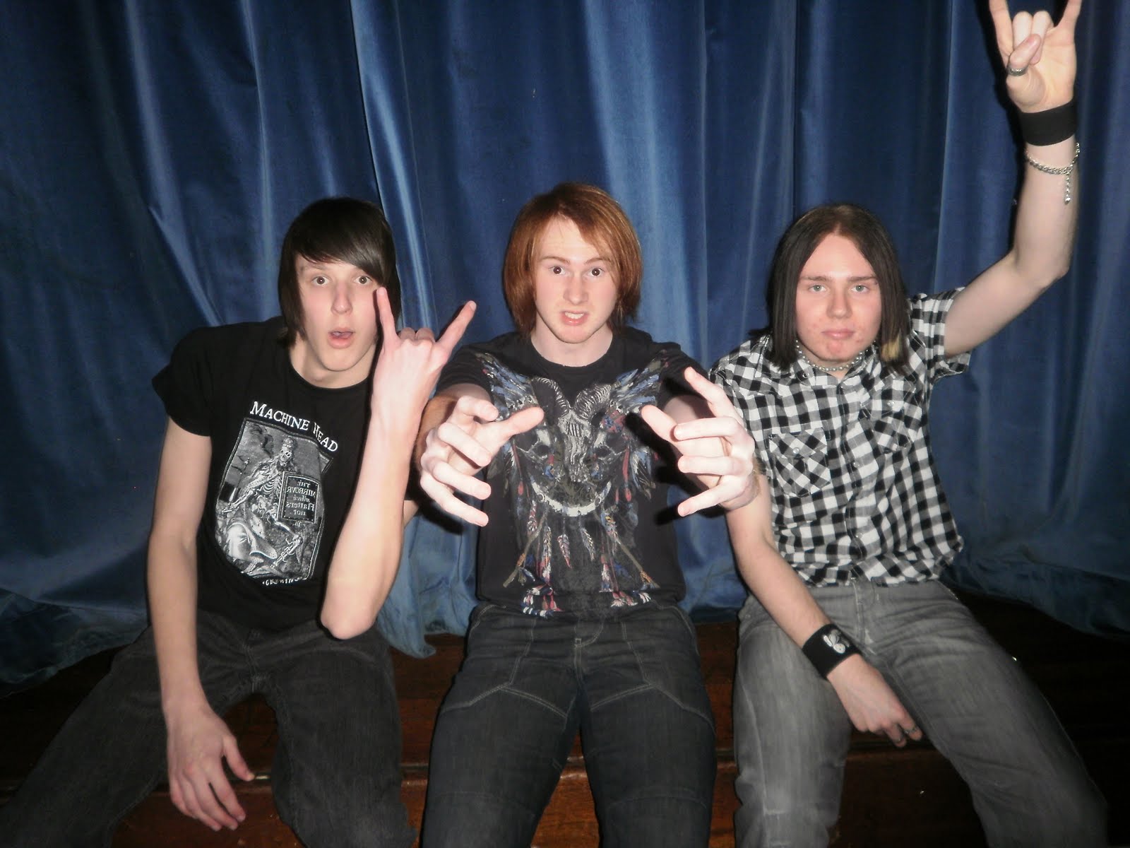
step 1)This is the photo i chose to use on my front page which i cropped firstly to make the picture a bit bigger in the terms of making the models take up more space on the page and cutting out the background on the side of the page completely to give the focus of the image on the models.

I then used the magnetic Laos tool


which allowed me to go around the models and separate them from the background doing this could then let me to change the colour of the background to black without affecting the models.


Step2)step 2 was adding all of the text to the front page which included the master heading and the main story,to do this i used the text placement
tool.


I then moved all of the text around the page to the relevant places and then chose the style of text for each piece of writing.For the piece of writing related to the main story located on the right side of the page i aligned each line of words so each line didn't look out of place or uneven.I did make the bottom line of writing slightly longer than the top to give a slight contrast to the sentence and make it look more to the style of the magazine of untidiness and rock'n roll with not everything being straight and in place where it would normally be in a normal mainstream music magazine


Step3) involved adding the pug to my front page which was done in three stages the first stage
was drawing out a red circle.


the second was putting a smaller black circle over the top of the red circle


i then used the dissolve option on the brush tool.


to dissolve the the red circle into the background to give the affect of the circle disintegrating.


Step4)Step 4 was themaking if the shapes to put behind the pieces of text on the page,to do this i used the shape selection tool.


I then drew out rectangles and other shapes and moved to the right places on the page,i also tilted all of them slightly so they were all on a slight slant to the left the same as the text.


Step5)Step 5 was the final step in constructing my front page which was putting the images on.I did this by dragging them into photo shop and them cropping them to a approrpaite size which then allowed me to place them on my front page without the problem of over sizing.


i did this by going to the top of the page clicking on image and then crop.


i then dragged the image onto the front page page and place it
where i wanted it.


Tuesday, 4 May 2010

results from Poll

Magazine name:Who Wants Some

price for a free gift if i choose to include one:30p

Price for the magazine:£2.00

magazine that people buy the most is:Metal Hammer

Colour Scheme i will be using:red,white,black

People listen to music:everyday

the genre of music that most people listen to is:metal

The majority of people who took my poll are between the ages of:17-22

The majority of people who took my poll are :male

Monday, 3 May 2010

Photograph Analysis


Front Page

1)This picture will be ideal for my front cover as their are the 3 members of the band that will be featuring in the story in my double page spread,they are all stood in a good position which very good and unique poses which are relevant to the style of the magazine.The space around all of the 3 models is very good as i can add text and pictures with out any problems of covering up the models faces,The contrast in colours is also good as their is not just one shade of colour their is a mixture of them which will work in the favour of the background i will be using and will make the models stand out more which is needed on a front cover.


Contents Page


2)I think this picture will work very well on my contents page as a heading to as it is a very clear big picture of the models and will sit well at the top of the page with text underneath it and maybe some around the edges.I think it also works well in conjunction with the (metal) style of my magazine with the colours involved,the props and the setting behind of a stage like scene.


Double Page

3)I think this is a perfect picture for my long shot images of the individual models as it shows the model clearly against a good background and leaves plenty of space in the corners of the pictures for me to add text.I have chosen this specific pose for the model because i think it is very unique and gives the impression he is very relaxed.I will be using this particular photo at a bigger size on the page than the others as in all music magazines the front man to any band is the main focus and has the biggest photo on the page when shot individually.


4)I have chosen these two pictures to use as group photos on the double page spread as i think they are very striking in terms of the poses and relevant backgrounds,which entail a stage scene which is the style throughout all of my images.I have made sure to get a good picture of the whole of the bodys of the group so that all of them are seen properly and not just the top half of them which i think is important in a group photo where a story is connected as it allows you to see properly who you are reading about and helps you understand the people a bit better by seeing the way they dress and look.


5)I will be using these two pictures on the double page spread for the individual pictures of each band member,Both of these two images have the same background as it is the same house style throughout all of the images.In lukes picture i felt using a amp as a prop for him to put his foot on would give more of a (metal) feel to his picture as he is the guitarist in the band the amp also fits his profile so i thought it would go very well in the picture.In joes picture i felt doing the pose of crossing his arms would be a good idea,as he is the drummer in the band sterotypicaly drummers in bands are not as involved as the others and are generally not seen or heard of as much as the others so i deemed it right to choose this pose to give the impression he dosent care and is slightly angry.


Sunday, 2 May 2010

Double Page Spread


My finished double page spread

Contents Page


My finished contents page

Front Page


My finished Front cover


Target Audience


This is a example of my target audience This is Andrew he is a metal head from london he is 26 and lives in a flat with his two roomates craig and paul.he dresses in a very noticable manner which is that of a typical metal head style of long hair,a leather jacket and a beard.Andrew loves to go to gigs,the pub,and partys with his friends on a regular basis,his motto for life is "live it to the full or you will not have lived at all"which is refelcted in his crazy and daring personality of being the one that will doing anything if asked regardless of the consequneces.Andrew has been playing the drums for the past 5 years and has become exceddingly good at it and is looking to join a band while continuing his daytime job as a cashier in HMV.Andrew enjoys reading,Kerrang and Metal Hammer magazine and his favourite bands are,Slipknot,Ill Nino,Trivum and Machine Head.